Here’s what nobody in the design world wants to admit: your bedroom color scheme is doing more identity work than your Instagram bio. The wall color you chose (or want to choose), the palette on your bedding, the accent tones on your shelf — those aren’t just “decor decisions.” They’re statements about who you are right now, what you’re drawn to, and how you want to feel when you’re alone in your own space. And if you’re a Gen Z woman between 16 and 25, you already know this instinctively, because your generation treats color as a language — not decoration.
The numbers back this up. Etsy reported that searches for personalized decor surged 313% heading into 2026, driven largely by Gen Z and Millennials who want their spaces to reflect individual identity rather than follow a single prescribed aesthetic. Dopamine décor — the bold, joy-first color approach that rejects beige minimalism in favor of emotional, personality-driven palettes — has dominated TikTok and Pinterest for the past two years and shows no signs of slowing down. But what’s changed in 2026 is that the movement has matured. Designers are calling it “heritage maximalism” — the shift from “more for more’s sake” to thoughtful, curated color layering that’s expressive without being chaotic.
Color is no longer about following a trend. It’s about building a visual identity. These 17 bedroom color ideas are designed for women who are doing exactly that. Product recommendations and specific guidance are throughout. Pin the palettes that feel like you. These decorative suggestions are meant as inspiration rather than science-based advice, and may include fictional scenarios.
Sage Green Walls: The Calming Color That Became a Whole Personality
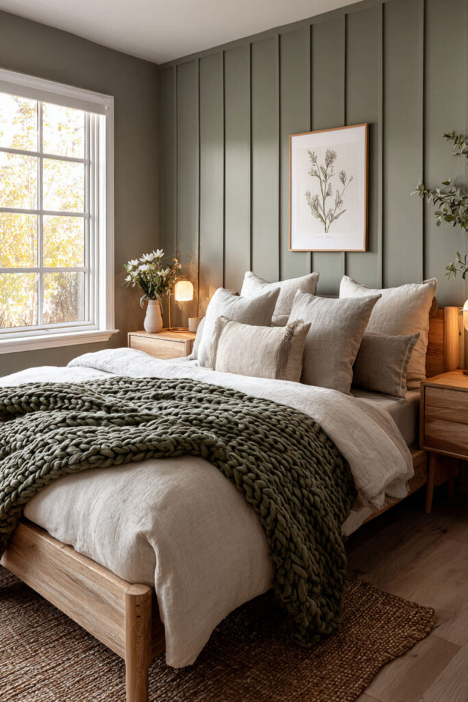
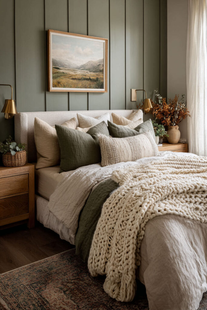
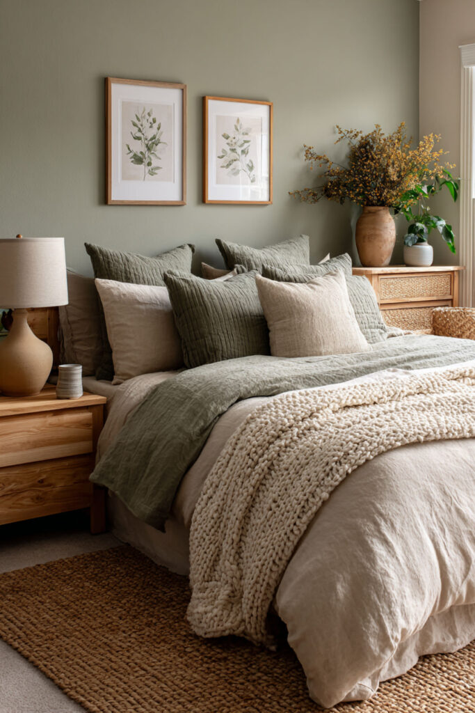
Sage green isn’t just a color anymore — it’s an entire aesthetic identity. It signals calm, intention, nature-connection, and a kind of grounded coolness that reads as effortlessly put-together. On Pinterest, sage green bedroom boards have exploded because the color works across multiple aesthetics: clean girl, soft minimalist, cottagecore, Scandinavian. It’s the rare wall color that says something specific about who you are without locking you into one look. I recommend a matte or eggshell sage green wall paint on all four walls or as an accent wall behind the bed — pair with warm white bedding, natural wood furniture, and one or two plants. The matte finish keeps it sophisticated rather than shiny. This sage green bedroom and calming green bedroom colors idea is the starting point for anyone whose aesthetic identity leans toward calm, intentional, and naturally cool.
Dopamine Color Palette: Bold, Joyful, and Unapologetically Loud
Dopamine décor is the Gen Z color movement, full stop. It’s the design philosophy that says if a color makes you feel good, it belongs in your room — matching be damned. Coral pink nightstand next to a cobalt blue wall next to a sunshine yellow throw? That’s not clashing. That’s serotonin architecture. The whole point is emotional impact over aesthetic rules: you pick colors based on how they make you feel, not on whether they coordinate in a traditional sense. I recommend starting with one bold wall color (cobalt, emerald, coral, or sunshine yellow) and building outward with two to three accent colors in bedding, pillows, and art that make you genuinely happy when you look at them. No neutral “balance” required. This trendy bedroom and bedroom color combination idea is for women whose aesthetic identity is joy-first, rules-last — and who want their room to feel like walking into their own personal highlight reel.
All-White with One Statement Color: Clean Girl Energy in Paint Form
The clean girl aesthetic translates into bedroom design as an all-white or near-white base with one single statement color that does all the talking. White walls, white bedding, white or light wood furniture — then one deliberate color injection: a dusty rose accent chair, a terracotta vase, a deep green throw pillow. The power of this approach is in its restraint. One color against white has ten times the visual impact of the same color surrounded by other colors, because the white gives it room to breathe and register. I recommend an all-white base (walls, bedding, curtains) with one accent color expressed in three to five places in the room — a pillow, a blanket, a piece of art, a lamp shade, a small rug. Keep the accent color consistent. This minimalist bedroom and bedroom color designs idea is for the person whose aesthetic identity is curated, intentional, and quietly confident — someone who speaks volumes by saying less.
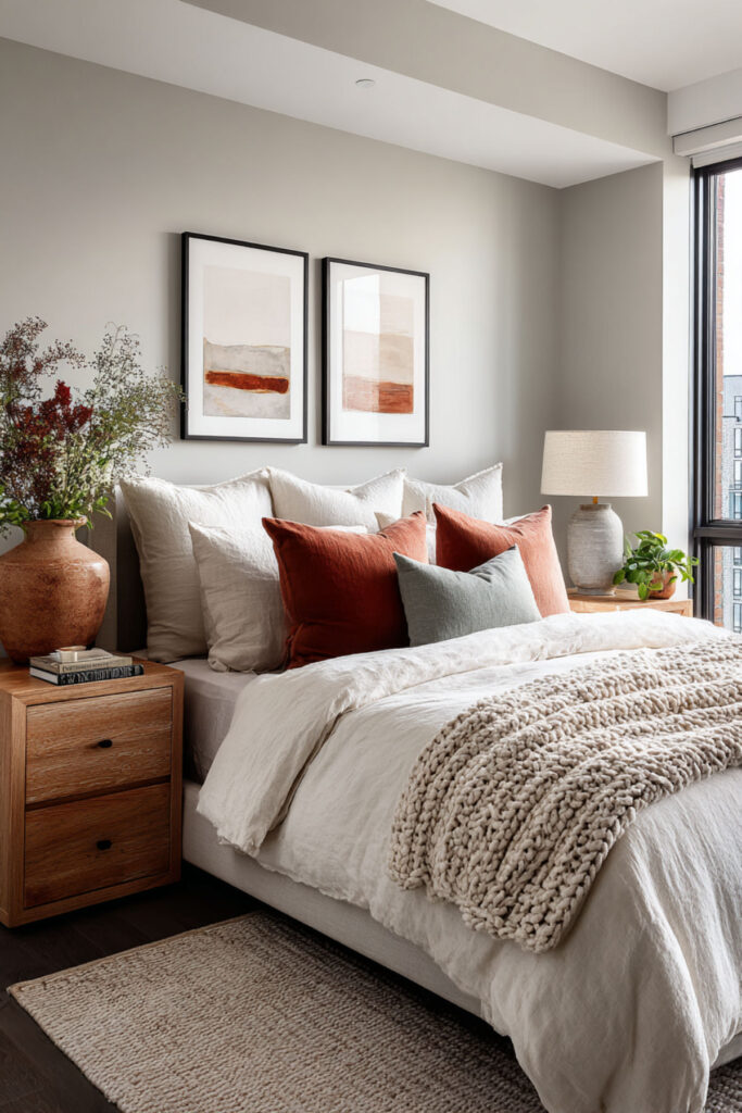
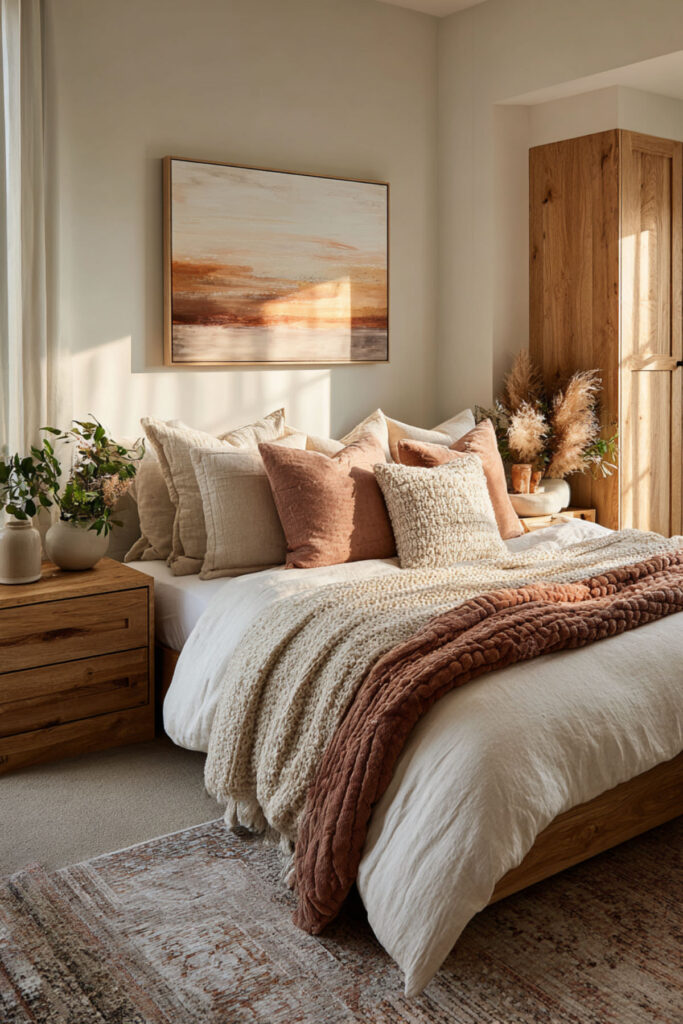
⫸ Click Here For Best Selling Sublimation Printers And Products ⫷Muted Earth Tone Palette: Warm Neutrals That Ground You
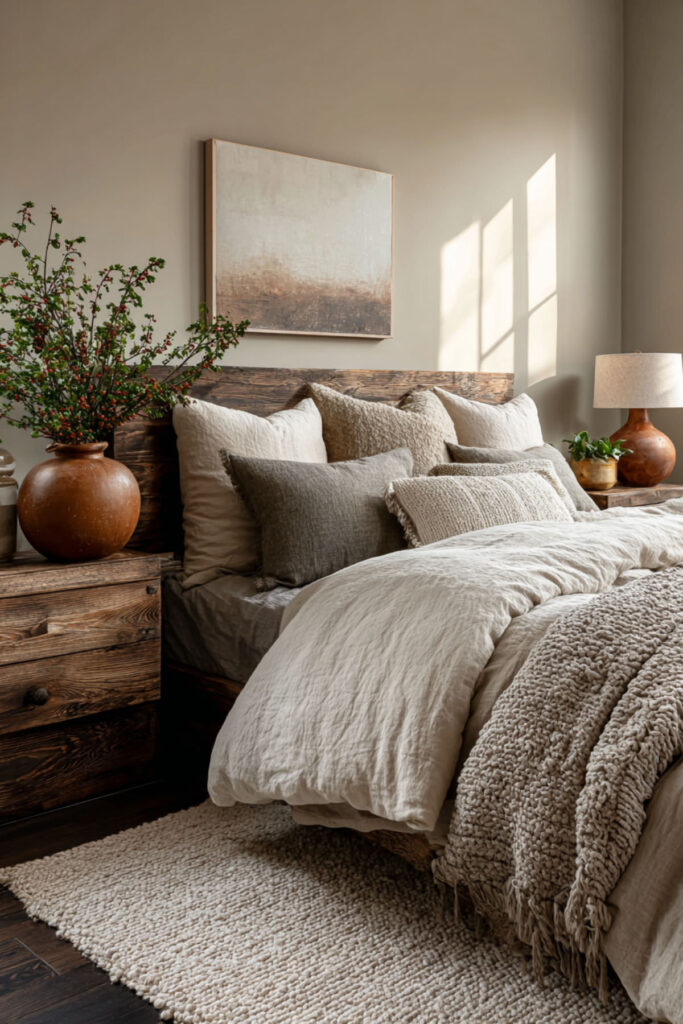
Earth tones — warm beige, terracotta, clay, sand, soft brown, muted olive — create a bedroom that feels like a hug you didn’t know you needed. These colors are warm without being aggressive, expressive without being loud, and they ground the nervous system in a way that cooler tones can’t. For Gen Z women who feel overstimulated by the digital world (which is most of us, honestly), an earth-toned bedroom becomes a sensory reset button. I recommend a warm beige or sand base on walls, with terracotta and clay accents in bedding, cushions, and ceramics. Add texture through linen, jute, and raw wood to amplify the earthy feel. This calming neutral bedroom colors and bedroom colour palette idea is for women whose aesthetic identity runs warm, grounded, and analog — the kind of person who prefers a ceramic mug to a neon sign, and whose room feels like it could exist beautifully offline.
Lavender and Digital Lilac: The Futuristic Pastel Identity
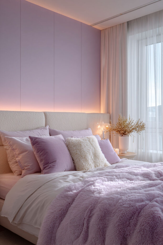
Lavender has gone from “grandmother’s bathroom” to one of the most-searched bedroom colors for Gen Z — and the shift happened because the shade itself shifted. The lavender trending in 2026 isn’t the dusty purple your aunt painted her guest room. It’s cooler, slightly greyed, sometimes described as “digital lilac” or “lavender haze” — a futuristic pastel influenced by tech aesthetics, lo-fi music visuals, and the soft-focus glow of screen culture. It’s calm, it’s slightly ethereal, and it reads as creative and dreamy without trying too hard. I recommend a muted lavender or digital lilac on walls (matte finish) with white and soft grey accents — white sheets, grey throw blanket, simple white-framed art. This calming paint colors for bedroom and modern bedroom colour ideas concept is for the person whose aesthetic identity sits at the intersection of calm and creative — someone who wants their room to feel like the inside of a daydream.
Black Accent Wall with Warm Accents: Dark Academia Energy
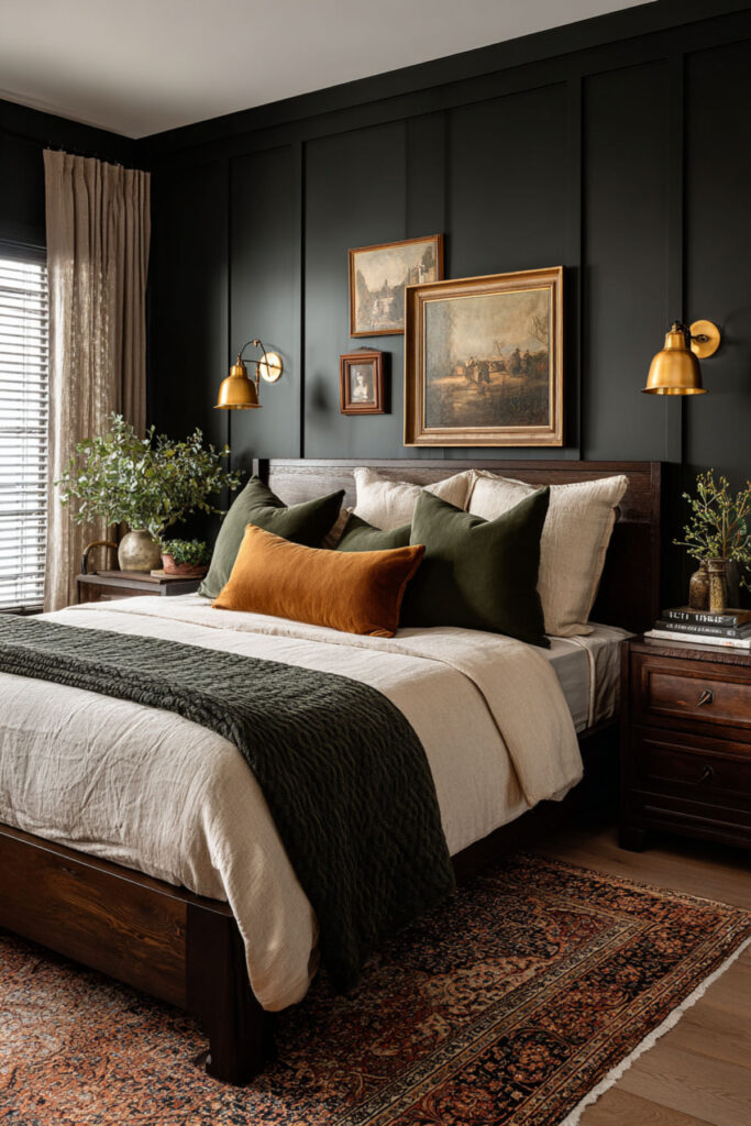
A black or very dark charcoal accent wall behind the bed is a power move that instantly changes the room’s identity from casual to cinematic. It creates depth, it makes everything in front of it pop (especially warm-toned wood and brass), and it signals a person who isn’t afraid of drama. Paired with warm accents — amber lighting, rich brown leather, vintage-toned art, deep burgundy textiles — a black wall creates the dark academia aesthetic that’s become one of Gen Z’s most enduring design identities. I recommend a matte black or deep charcoal paint on one wall (behind the bed), with the remaining walls in warm white or cream. Layer warm accents: brass or gold lamp, rich brown or burgundy throw, vintage-style art in wooden frames. This bedroom wall colors and paint color ideas for bedroom concept is for the woman whose aesthetic identity runs moody, literary, and intentionally dramatic — someone whose room feels like the opening scene of a film she’s directing.
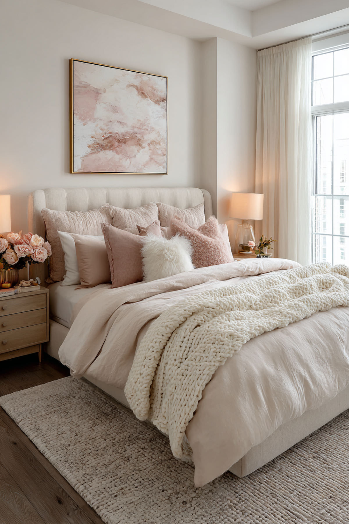
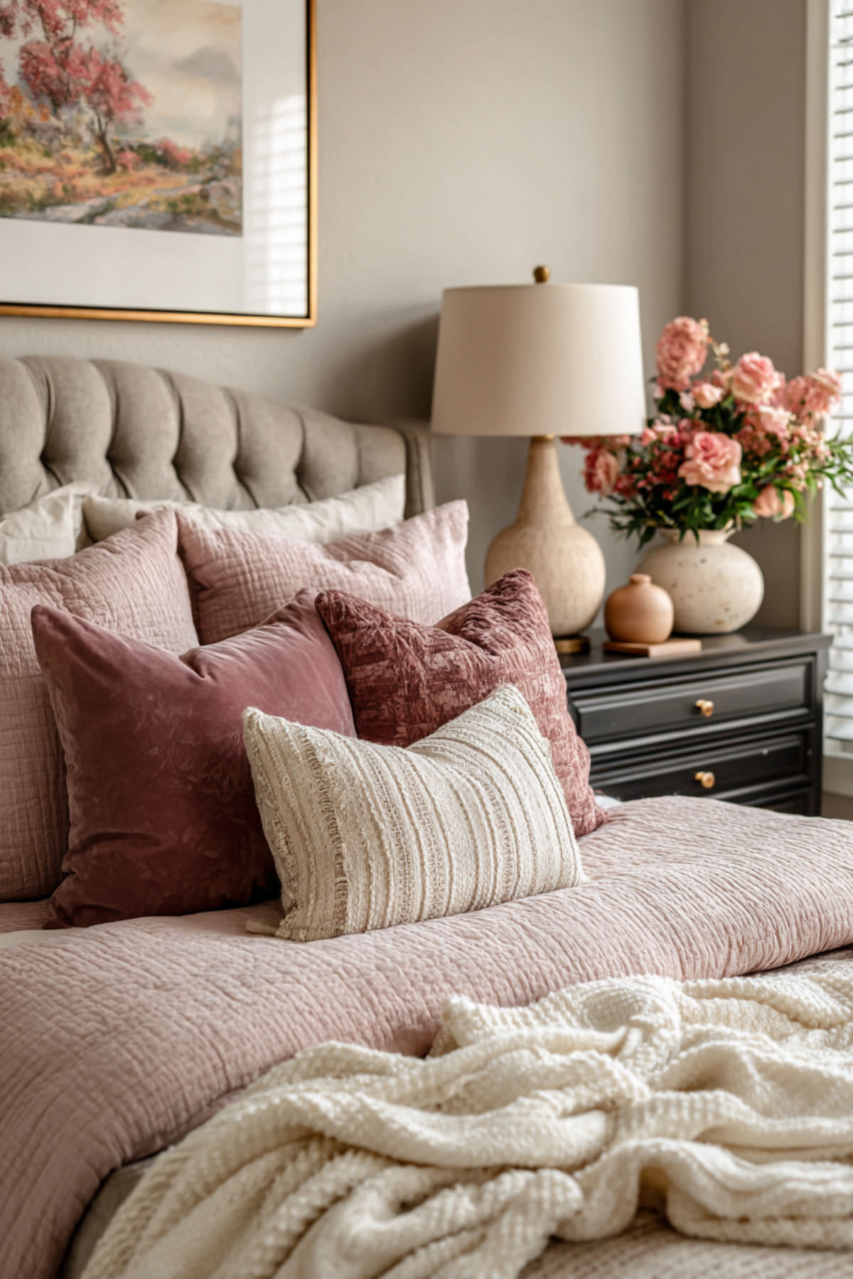
Soft Pink Monochrome: Color-Drenching for the Romantically Bold
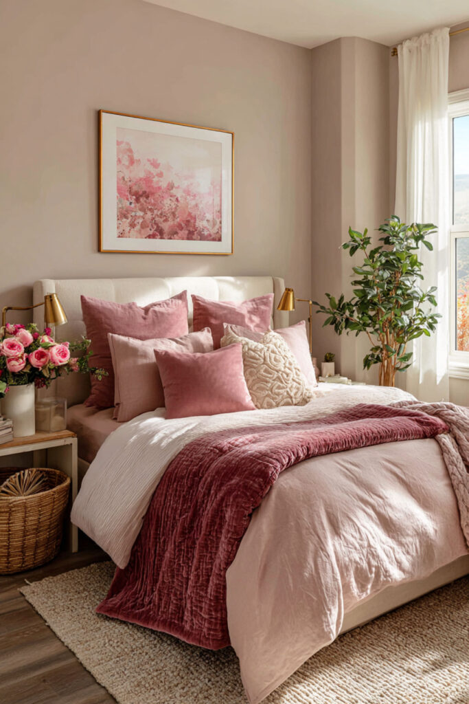
Color-drenching — painting the walls, trim, ceiling, and sometimes even the door in the same color — is one of the biggest interior design movements of 2026, and soft pink is where it hits hardest. A fully pink-drenched room doesn’t look childish. It looks immersive, confident, and weirdly serene, because when every surface is the same tone, your eye has nothing to jump between — the room becomes a single visual experience. Dusty pink, blush, rose — any muted pink works. I recommend a single shade of muted pink (dusty rose, blush, or warm pink) applied to walls, ceiling, and trim in matte finish. Keep furniture and bedding in the same tonal family (cream, warm white, light wood). This bedroom paint colors and colour scheme for bedroom idea is for the woman whose aesthetic identity is romantically bold — feminine without apology, soft but never passive, and completely uninterested in playing it safe.
Warm Grey Base with Colored Accents: The Adaptive Identity Room
Warm grey walls are the bedroom equivalent of a really good pair of jeans — they go with absolutely everything, and they let you change your aesthetic identity without repainting. A warm grey base (not cool grey, which reads sterile) creates a sophisticated neutral canvas that adapts to whatever accent colors you’re drawn to right now: sage green this month, terracotta next season, cobalt in the winter. Your room evolves with you. I recommend a warm grey with brown or taupe undertones on all walls, with accent colors expressed through bedding, throw pillows, art, and one or two decor objects. Change the accents seasonally or whenever your mood shifts. This calming bedroom wall colors and bedroom color schemes idea is for the woman whose aesthetic identity is still forming — and who’s smart enough to build a room that can grow and shift with her rather than boxing her into one look.
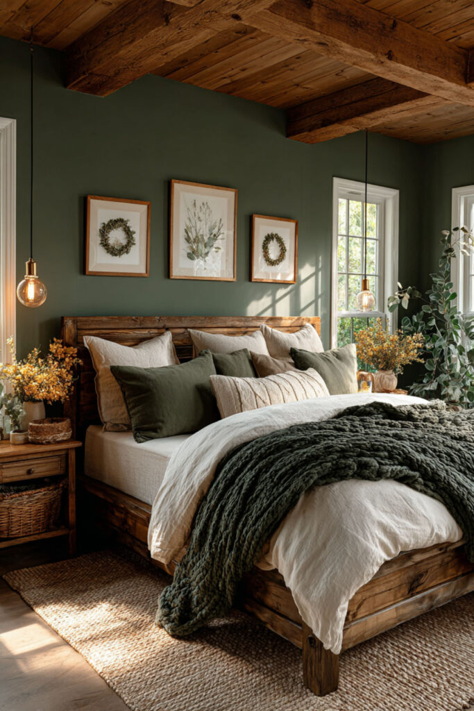
Forest Green + Brass: Rich, Grounded, and Quietly Luxurious
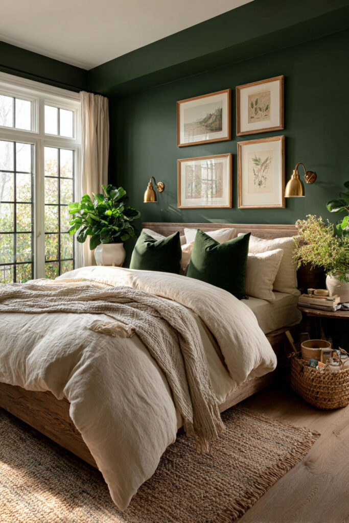
Forest green paired with brass or gold accents creates one of the most sophisticated palettes available to a bedroom — it looks expensive without being pretentious, bold without being overwhelming, and deeply connected to nature while also feeling undeniably modern. The green anchors the room in calm, and the brass adds warmth and just enough metallic gleam to elevate the whole thing from “earthy” to “editorial.” I recommend forest green or deep emerald on one accent wall or all four walls (matte finish), with brass or gold accents in lighting (table lamp, pendant), hardware (drawer pulls, curtain rod), and one or two decor pieces (frame, tray). Keep bedding neutral — cream, white, or warm grey. This bedroom paint ideas and bedroom wall paint colour concept is for the woman whose aesthetic identity is grounded luxury — someone who wants richness without excess and nature-connection without being predictable.
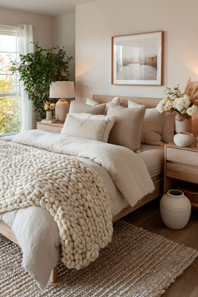
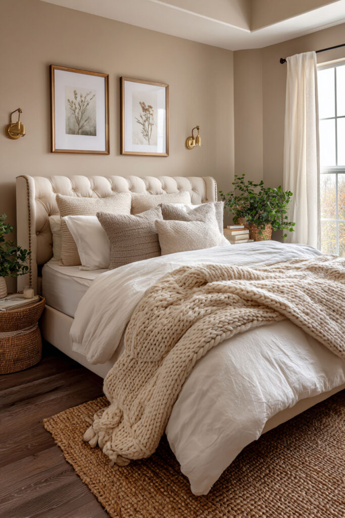
Beige and Cream Tonal Layering: The Quiet Luxury Bedroom
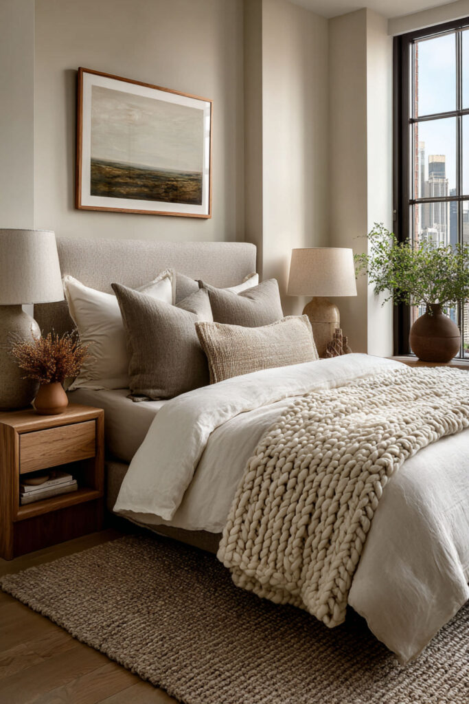
Tonal layering — building a room from multiple shades of the same color family — is one of the most design-literate moves you can make, and beige-to-cream is where it looks most effortlessly expensive. Different textures in the same tonal range (linen sheets in warm white, a chunky knit throw in oat, a velvet pillow in sand, curtains in cream) create visual depth without any color contrast, which makes the room feel incredibly calm and cohesive. It’s quiet luxury translated into bedroom design. I recommend building the entire room in the beige-cream-oat-sand range with no true accent color — instead, create interest through texture: linen, cotton, wool, velvet, wood, ceramic. Every surface should feel slightly different to the touch while looking unified to the eye. This calming bedroom colors and neutral bedroom paint shades idea is for the woman whose aesthetic identity whispers rather than shouts — someone who understands that complexity doesn’t require contrast.
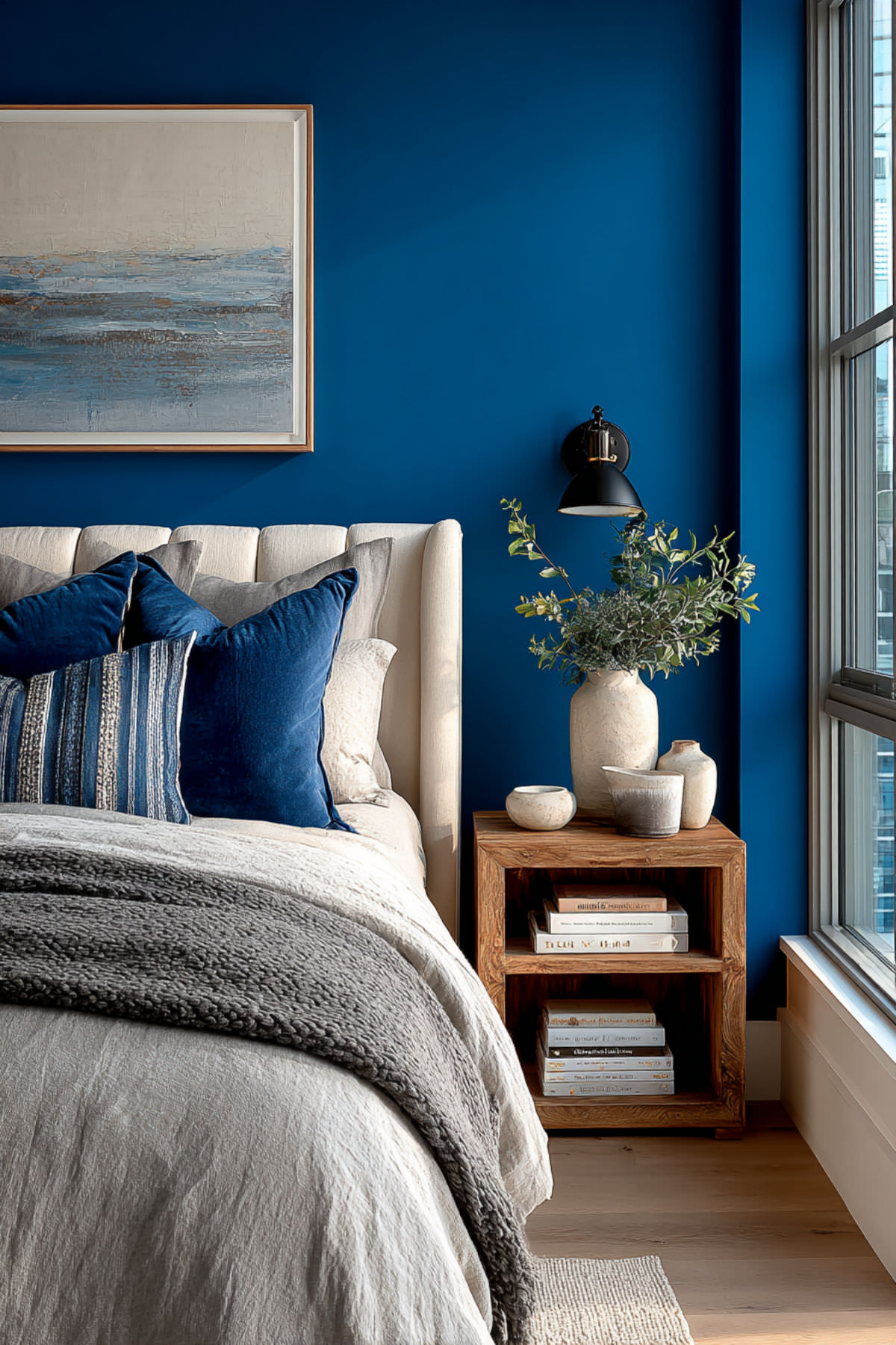
Cobalt Blue Statement Wall: The Confidence Color
Cobalt blue on a wall is not subtle, and that’s the point. It’s one of the most energizing, attention-commanding colors you can put in a bedroom, and it communicates something unmistakable: the person who lives here is not playing small. Cobalt works because it’s bold enough to be a statement but cool enough to still support sleep — blue is consistently one of the best-performing colors for rest. I recommend cobalt blue on one statement wall (behind the bed) in matte or satin finish, with the remaining walls in warm white or light grey. Pair with warm wood furniture, white bedding, and one or two orange or warm-toned accents for a complementary pop that makes the blue sing. This bedroom wall color ideas and modern bedroom color ideas concept is for the woman whose aesthetic identity is confident, expressive, and a little bit fearless — someone who walks into a room and wants the room itself to match that energy.
Dusty Rose and Olive Green: The Unexpected Pairing That Works
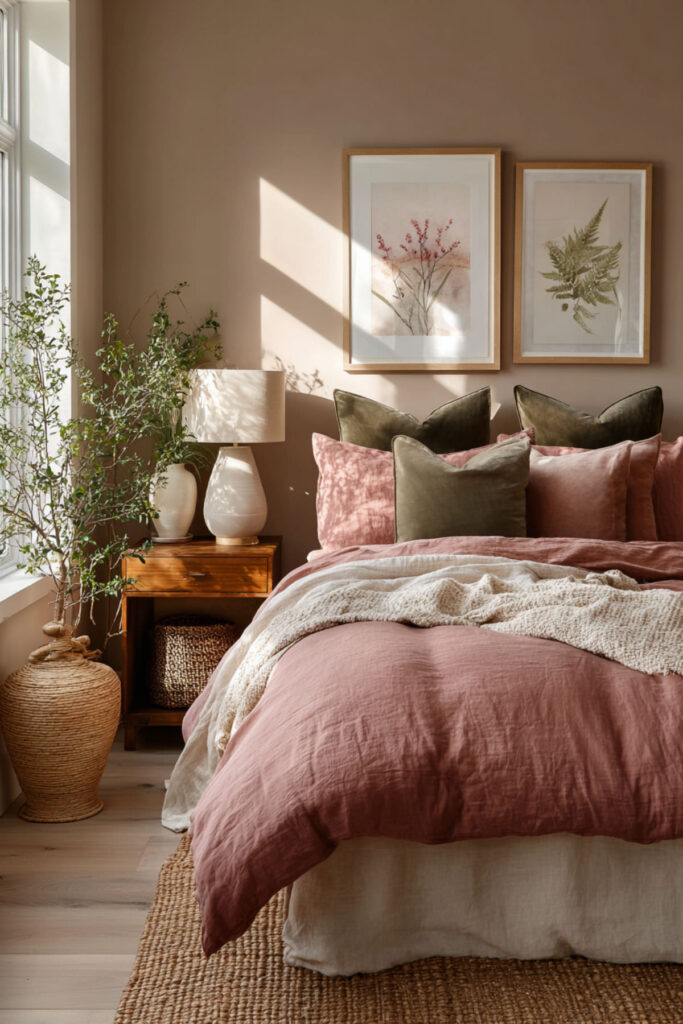
Dusty rose and olive green shouldn’t work together — pink and green, really? — but they do, and beautifully. The secret is that both colors are muted and desaturated, which means they sit in the same tonal universe even though they’re on opposite sides of the color wheel. Together they create a palette that’s nature-inspired, gently romantic, and distinctly original. Nobody else in your group chat has this combination, and that matters when your room is part of your identity. I recommend olive green walls (or an accent wall) with dusty rose accents in bedding, throw pillows, and one piece of art. Add warm white and natural wood to bridge the two tones. Or reverse it: dusty rose walls with olive green accents. Either direction feels fresh. This color combo for bedroom and room decor color schemes idea is for the creative thinker whose aesthetic identity breaks rules on purpose — not for shock value, but because her instincts are better than the conventional advice.
Warm White Walls with Textured Neutrals: The Scandi-Hygge Foundation
Sometimes the most powerful color choice is the absence of color — done right. Warm white walls (not bright white, not cool white, but a white with the faintest cream or yellow undertone) create the luminous, airy foundation of Scandinavian and hygge-inspired design. The room’s character comes entirely from texture: a chunky knit blanket, a linen duvet with visible weave, a jute rug, a wooden shelf, a ceramic vase. Each object adds warmth through material rather than pigment. I recommend warm white on all walls (look for names with “cream,” “linen,” or “cloud” in them), with layered neutral textures in bedding, rugs, and decor. No accent color necessary — the warmth comes from material contrast. This hygge bedroom and Scandinavian room idea is for the woman whose aesthetic identity values calm above everything — someone who finds peace in simplicity and beauty in the grain of a wooden shelf.
Terracotta Accent Wall: Warm, Artistic, and Grounded
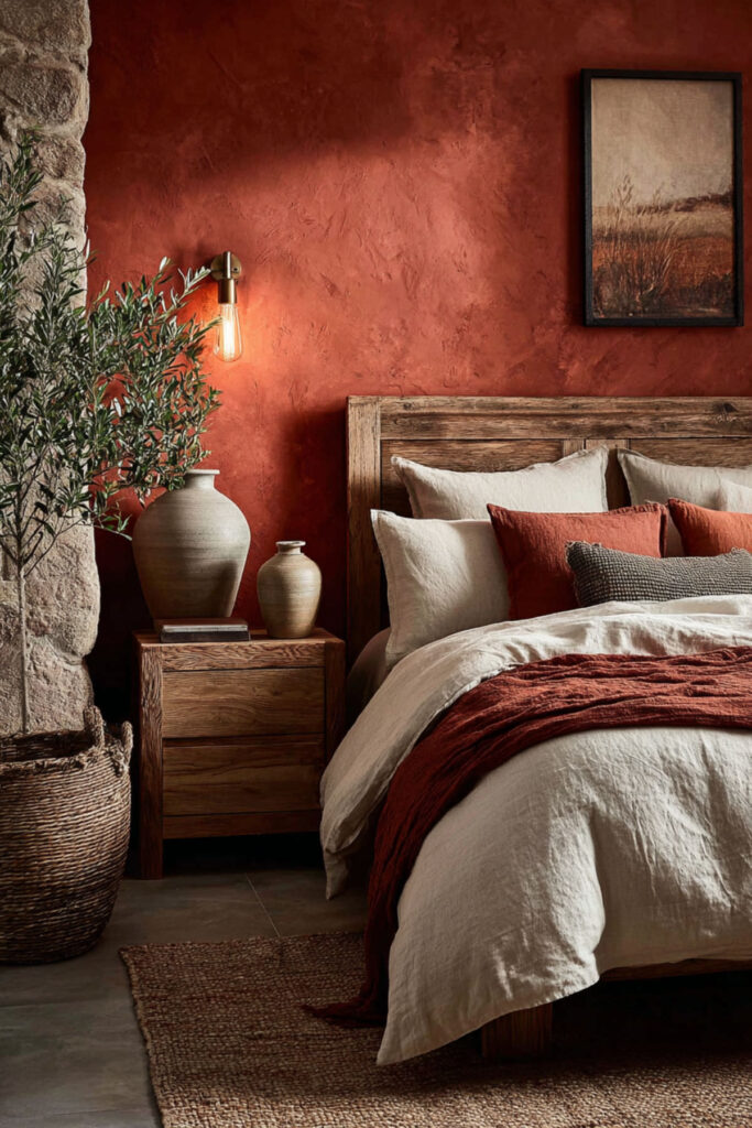
Terracotta is earth and fire in one color — warm, alive, and rooted. As an accent wall behind the bed, it creates a focal point that feels both ancient and completely modern. It pairs naturally with cream, warm white, sage green, and warm grey, and it looks incredible with natural wood, dried grasses, and handmade ceramics. Terracotta reads as artistic, intentional, and connected to craft traditions that span cultures — Mediterranean, Southwest, African-inspired, bohemian. I recommend a warm terracotta paint on one accent wall behind the bed (matte finish), with cream or warm white on the remaining walls. Layer with natural materials: linen bedding, woven baskets, wooden nightstand, one or two dried floral arrangements or sculptural objects. This paint colors and bedroom aesthetic idea is for the woman whose aesthetic identity draws from global craft, warm textures, and the belief that a room should feel handmade even when it isn’t.
Mood Lighting as Color: RGB and Warm LEDs That Change Your Room’s Identity
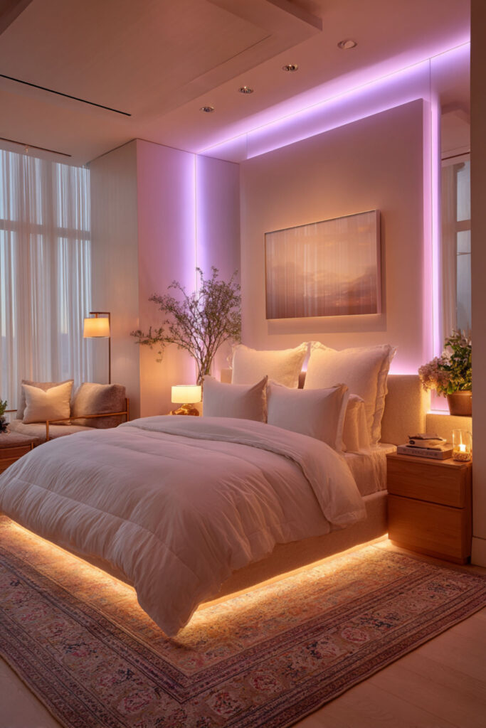
Here’s an idea that most design blogs won’t tell you: you don’t have to paint your walls to change your bedroom’s color. RGB LED strip lights behind the bed, around a mirror, or along a shelf can shift your room from warm amber to cool blue to soft pink to deep purple — and they can do it based on your mood, the music you’re listening to, or whether you’re studying, creating content, or winding down for sleep. Color through lighting is temporary, responsive, and infinitely customizable, which makes it the most Gen Z approach to color identity possible. I recommend RGB LED strip lights with app control and music sync placed behind the headboard and along one shelf or desk edge, plus a warm-toned smart bulb (2700K default) in the main lamp. This lets you shift the room’s entire mood without changing a single physical object. This modern bedroom colours and uplifting bedroom colors idea is for the woman whose aesthetic identity isn’t one thing — it’s contextual, adaptive, and always evolving.
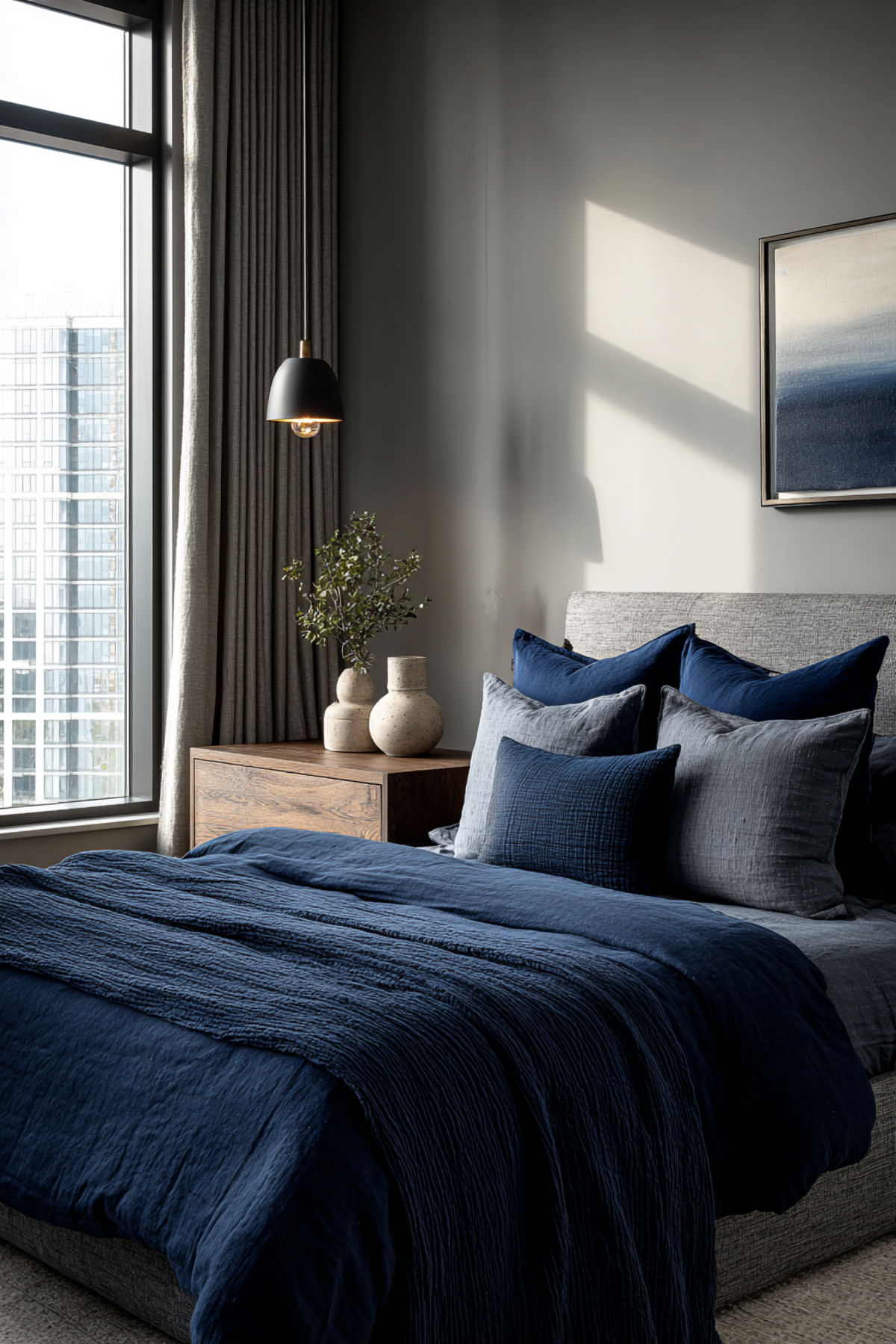
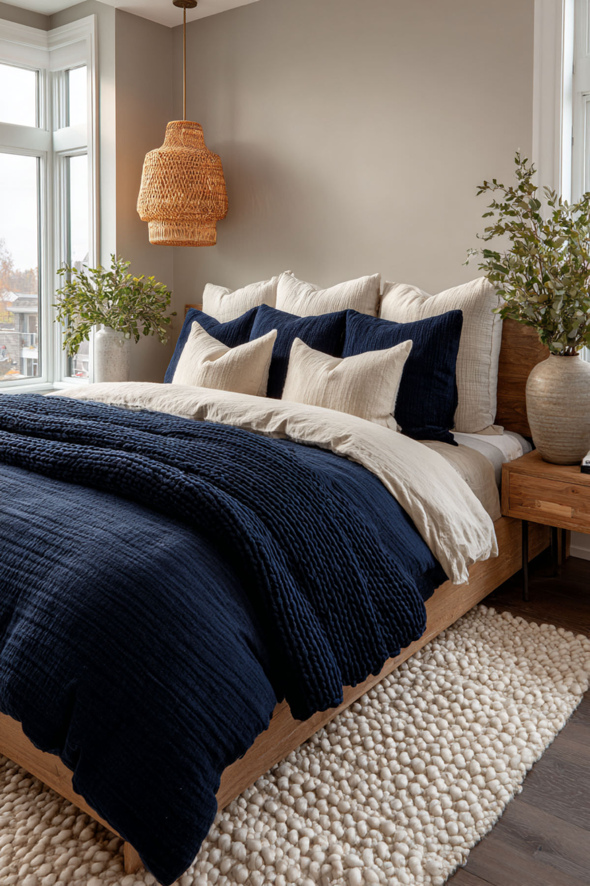
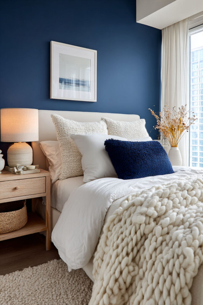
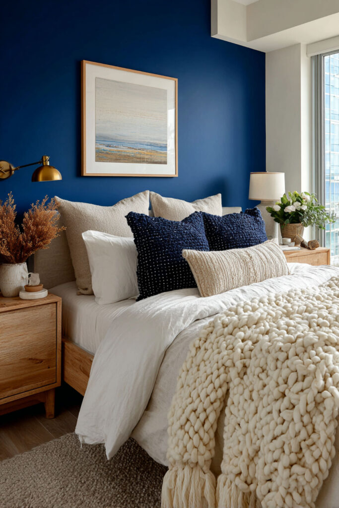
Navy and Cream: The Timeless Palette That Never Stops Working
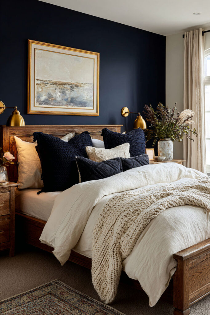
Navy blue and cream together create what designers call a “fail-proof palette” — it’s been working in bedrooms for decades and it will keep working because the contrast is inherently balanced: deep and light, cool and warm, bold and soft. Navy walls with cream bedding look expensive. Cream walls with navy accents look refined. Either direction works, and the palette adapts to almost any secondary accent color you add later (blush, gold, sage, terracotta). I recommend navy blue on walls or as the primary bedding color, with cream as the counterbalance. Add one metallic (brass or gold) for warmth. This calming wall colors bedroom and serene bedroom colors idea is for the woman who wants a room that feels established — someone whose aesthetic identity includes sophistication, intentionality, and the confidence to choose something proven rather than something trending.
Building Your Color Identity: How to Choose a Palette That’s Actually You
This is the idea behind all the other ideas: your bedroom palette should come from you, not from a trend report. Here’s how to find it. Step one: open your camera roll and screenshot the last ten images that made you feel something — outfits you loved, sunsets, interiors, food, art, anything. Look at the colors that repeat. That’s your instinctive palette. Step two: identify your mood anchor. Do you want your bedroom to calm you, energize you, ground you, or inspire you? Calm points toward muted tones and cool colors. Energy points toward saturated warm tones. Grounding points toward earth tones. Inspiration points toward unexpected combinations. Step three: pick three to four colors from your instinctive palette that align with your mood anchor, and commit. Wall color, bedding, accents — all from those three to four tones. This bedroom color schemes and color palette idea is the strategy that makes every other idea on this list work, because it starts with the only design brief that matters: who you are right now, and what you need your room to feel like.
Your Room Is Your First Draft
Your aesthetic identity at 18 won’t be your aesthetic identity at 25, and that’s the whole point. A bedroom is not a final statement — it’s a working draft, a visual journal entry, a space that evolves as you do. The wall you paint sage green this year might be cobalt blue next year and warm white the year after that. Each version is real. Each version is you. The only wrong choice is a room that looks like someone else’s Pinterest board instead of your own. You’ll love these Soothing Lavender Bedroom Ideas for Sleep-Deprived New Moms for a bedroom that feels calming, gentle, and perfect for much-needed rest.
Pin the palettes that pulled you in. Save the ones you want to try when you’re ready. And when you need more ideas — for lighting, for layout, for the textures that make color come alive — the rest of our site is here. Go build the room that looks like you sound.
Here are a few more ideas that may inspire you later — remember to save them.
Hope you discovered inspiration here—there are many more dreamy bedroom ideas on my site.
⫸ Click Here For Best Selling Sublimation Printers And Products ⫷