Sleep changes in your fifties. It’s not that you can’t sleep — it’s that the sleep you get doesn’t restore you the way it used to. You wake up at 3 AM for no reason. You lie in bed with your mind running a highlight reel of every unresolved conversation from the week. You finally drift off and the alarm goes half an hour later. Hormonal shifts, stress patterns that have calcified over decades, bodies that run warmer at night than they used to — these are real, physiological realities, and they change what a bedroom needs to do for you.
Color is one of the most powerful and most overlooked tools in that equation. The color on your walls affects how your nervous system responds to the room before you’re even conscious of it. Research in color psychology consistently shows that soft, muted tones — particularly blues, greens, and warm neutrals — reduce visual stimulation, lower perceived stress, and support the body’s natural wind-down process. Interior designer Laura Hammett has noted that she always utilizes soft, calming palettes for clients seeking better sleep, emphasizing tones that foster an environment where the mind can genuinely unwind. This isn’t about trends. This is about choosing the color that helps your body do the thing it’s struggling to do: rest deeply.
I’ve put together 16 calming bedroom colors for women in this exact phase of life — colors that are elegant, timeless, and chosen specifically for their ability to support deep rest. Pin the ones that feel right, save them, and browse the rest of our site for more. These decorative ideas are inspirational rather than scientific, and some situations mentioned may be fictional.
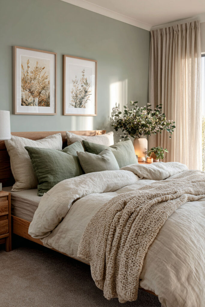
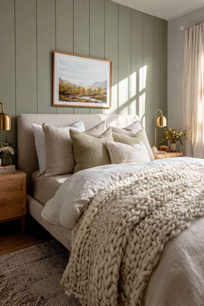
Sage Green: The Most Reliable Calming Bedroom Color
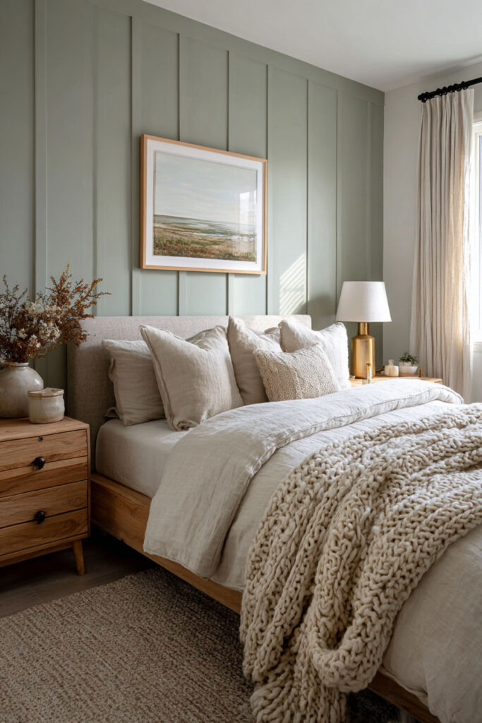
Sage green has earned its reputation. It’s the color that appears on nearly every list of calming bedroom colors, and it’s there for a reason — it combines the restorative quality of green (which the brain associates with nature, safety, and renewal) with grey undertones that prevent it from feeling too vibrant or stimulating. Designer Isy Runsewe has called muted sage green one of the most reliable sleep-enhancing colors because it draws from nature’s calming effect on the nervous system while reading as a gentle neutral that layers easily with natural woods and soft textiles. I strongly recommend sage green for the main bedroom walls in either a flat or matte finish — the matte surface absorbs light instead of reflecting it, which further reduces stimulation at night. Pair it with cream bedding and warm wood furniture. This sage green bedroom and calming green bedroom colors idea is the safest, most proven starting point for a bedroom designed around rest.
Dusty Blue: Cool Calm That Lowers the Temperature
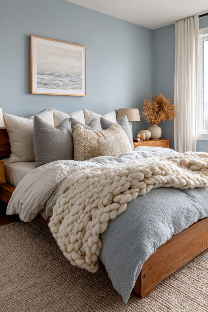
Blue is the color most strongly linked to relaxation and sleep in color psychology research. Part of why it works: blue tones trigger a subtle cooling response in the brain, which aligns with the body’s natural process of lowering its internal temperature before sleep. Dusty blue — a soft, muted blue with grey undertones — delivers that effect without feeling cold or clinical. It reads as calm, mature, and quietly elegant. I recommend a dusty blue paint in a flat finish for bedroom walls — avoid anything too saturated or too close to baby blue, which can feel juvenile. Pair dusty blue with white trim, cream linens, and brushed brass or gold accents for warmth. This calming bedroom colors and relaxing bedroom colors idea is the choice for women who gravitate toward cool tones and want a bedroom that feels like a clear, quiet evening.
Warm Off-White: The Calm, Breathable Backdrop
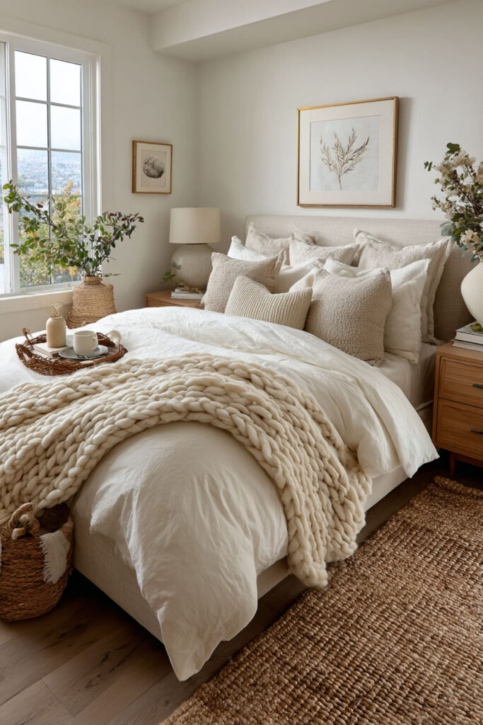
Not every calming bedroom needs color on the walls. A warm off-white — ivory, cream, or a white with yellow or pink undertones — creates a calm, breathable backdrop that reflects soft light and makes the room feel open and restful without any visual weight. Designer Ginger Curtis of Urbanology Designs has noted that warm off-white creates a calm, breathable backdrop without feeling stark — and it was endorsed as ideal for sleep spaces even as Pantone named Cloud Dancer (a bright white) its 2026 Color of the Year. The key word is warm. Cold, stark white can feel sterile and institutional. Warm off-white feels like linen, like morning light, like a room that holds you gently. I recommend a warm off-white with cream or ivory undertones in an eggshell or flat finish — and I recommend painting the ceiling the same color as the walls for a seamless, cocooning effect. This calming neutral bedroom colors idea is for the woman who wants peace without committing to any specific color direction.
⫸ Click Here For Best Selling Sublimation Printers And Products ⫷Soft Greige: The Elegant Neutral for Every Light Condition
Greige — the midpoint between grey and beige — is one of the most adaptable calming neutrals available. It shifts throughout the day with the light: cooler and more grey in the morning, warmer and more beige in the evening under lamp light. This chameleon quality means it always looks calming, regardless of what time you see it. It’s also one of the most sophisticated neutrals for a mature bedroom — it reads as intentional, understated, and timeless. I strongly recommend a soft greige like Benjamin Moore’s Edgecomb Gray or Balboa Mist for bedroom walls — both lean warm without being yellow, and both work beautifully with white trim, warm wood, and linen textiles. This Edgecomb Gray and Balboa Mist and calming gray and beige tones idea is the neutral that never dates, never overwhelms, and always supports rest.
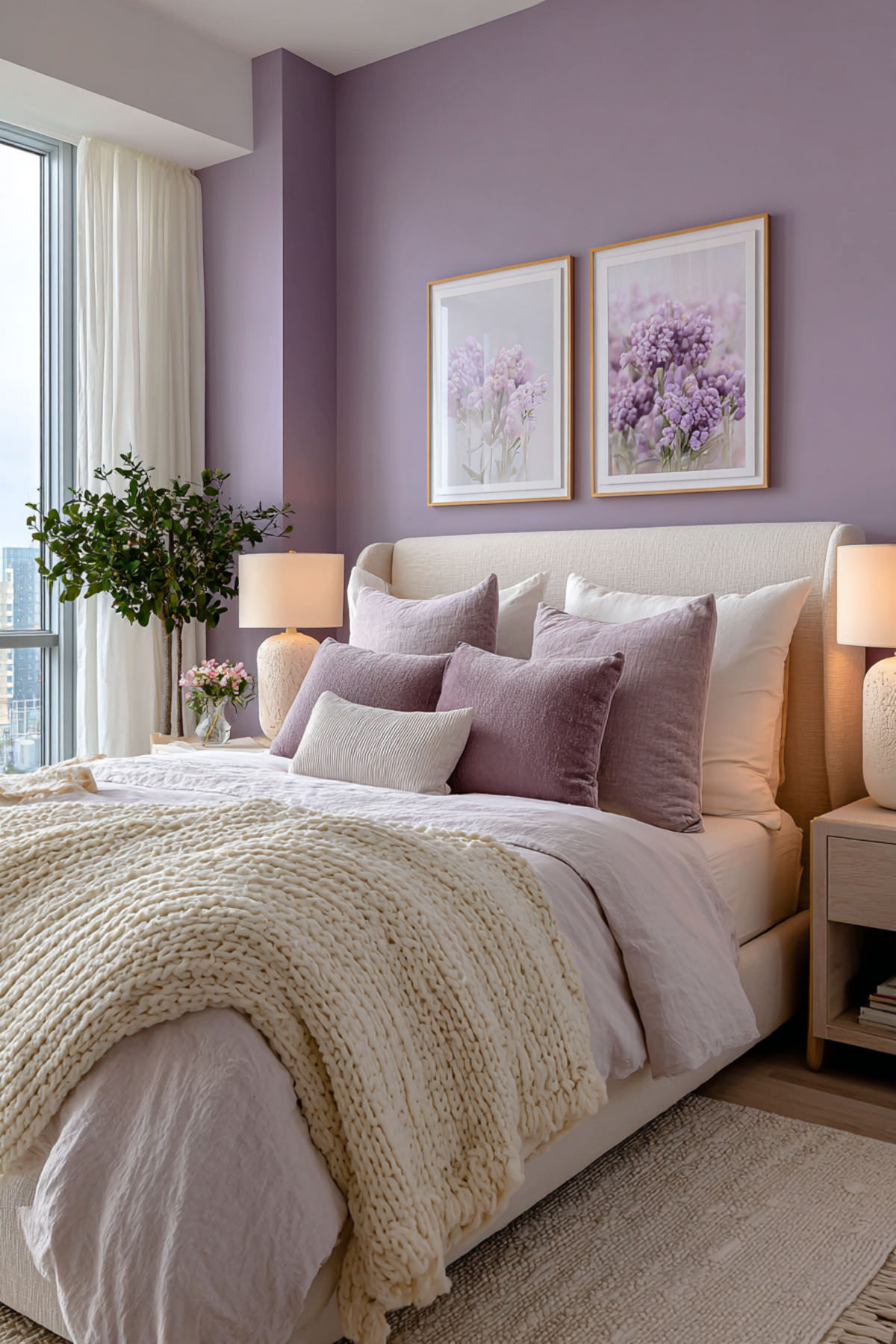
Pale Lavender: Gentle Color with Sleep-Supporting Calm
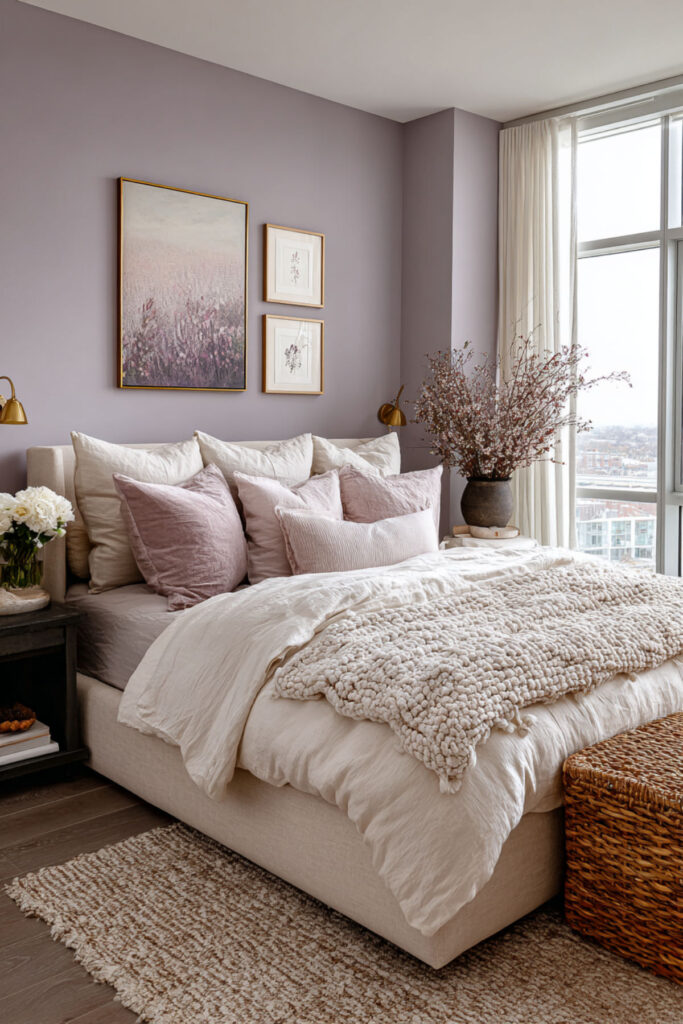
Lavender is strongly associated with relaxation — not just as a paint color, but as a scent and a cultural symbol of calm. As a wall color, pale lavender (not purple, not violet — pale, muted, with grey undertones) brings a softness to the room that’s unique among calming colors. It has just enough color to feel warm and intentional without being stimulating. It also pairs beautifully with silver, soft grey, and white — a palette that feels distinctly feminine without being young. I recommend a pale lavender or dusty lilac paint with grey undertones in a flat finish — avoid anything too pink or too purple, which can feel energizing rather than calming. Pair with grey or white bedding and muted metallic accents. This calming bedroom colors and soothing bedroom colors idea is for the woman who wants a whisper of color that still reads as serene and sophisticated.
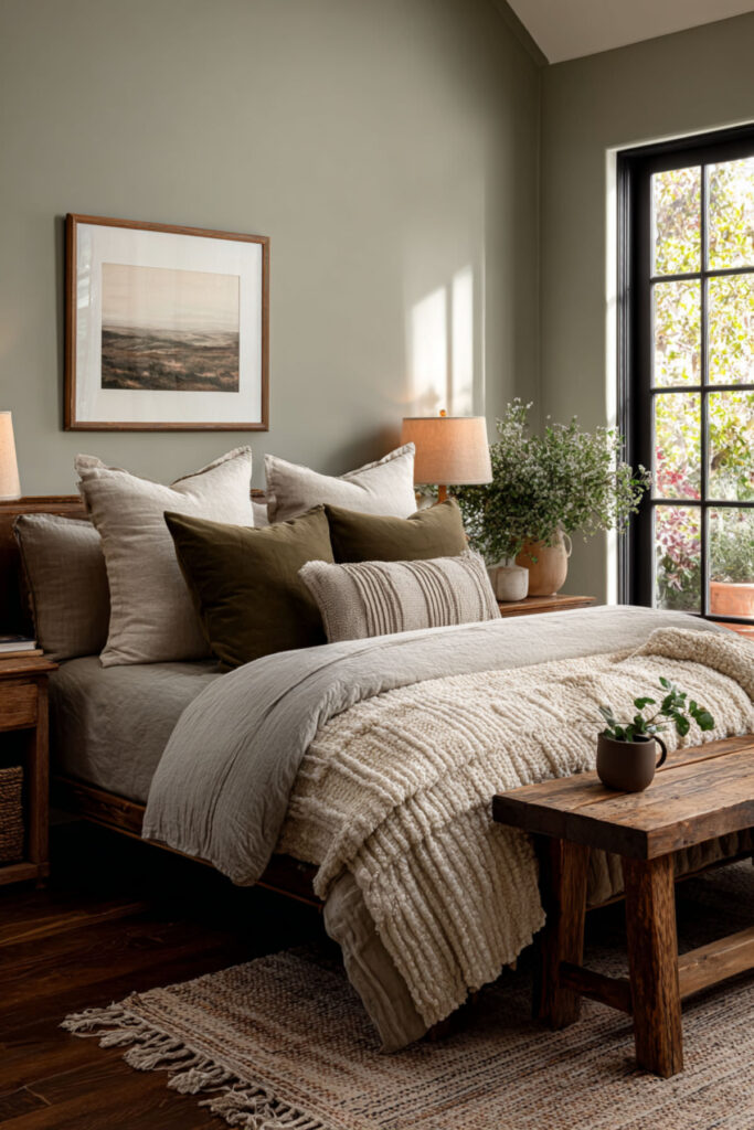
Warm Taupe: Grounded, Cozy, Timeless
Taupe is a warm brown-grey that brings an earthy, grounded quality to the bedroom. It feels like a room wrapped in cashmere — warm, soft, and substantial without being heavy. For women in their fifties who’ve moved beyond trend-chasing and want a color that feels both elegant and permanent, taupe is the color that says “I chose this because it feels right, not because it’s on a mood board.” I recommend a warm taupe with brown and pink undertones — avoid anything that pulls too grey, which can feel flat and lifeless. Pair it with cream, ivory, blush, and rich warm woods like walnut. This calming bedroom colors cozy and neutral bedroom paint shades idea is the color for a room that feels like a retreat from the outside world — warm, quiet, and deeply personal.
Eucalyptus Green: Fresh, Earthy, Naturally Calming
Eucalyptus green sits between sage and mint — it’s a cool-toned green with subtle grey undertones that feels fresh and organic without being sharp. It’s the color of a morning garden, and it brings that same feeling of renewal and quiet energy into the bedroom. Unlike deeper greens (which can feel heavy) or brighter greens (which can overstimulate), eucalyptus hits the exact middle ground: calming but not sleepy, fresh but not cold. I highly recommend eucalyptus green for a bedroom that gets good natural light — the cool tones balance the warm light beautifully. Pair with natural wood furniture, white linen, and woven textures like jute or rattan. This calming green paint colors for bedroom and green bedroom design idea brings the outdoors in without competing with the room’s purpose: rest.
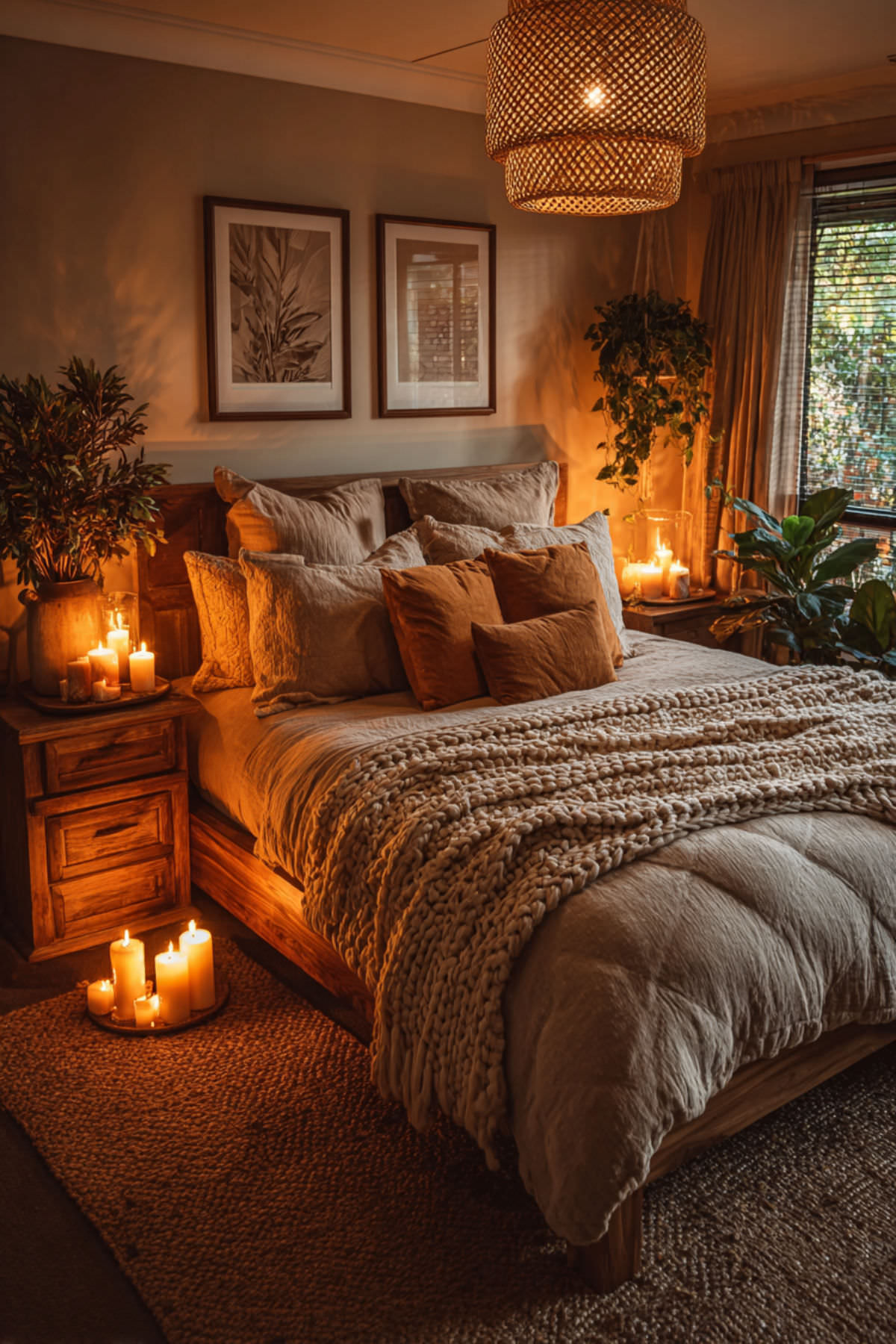
Soft Clay: Earth-Tone Warmth for Evening Comfort
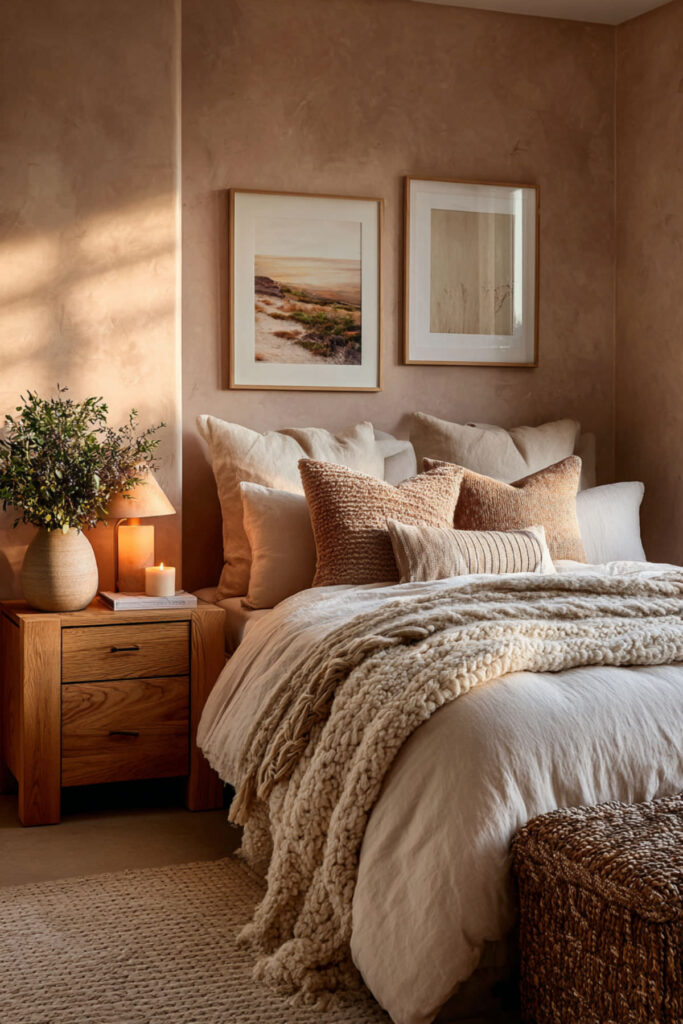
Soft clay — a muted terracotta that’s more pink-brown than orange — is the warm-toned calming color that most people overlook. Clay tones are grounding in a way that cool colors aren’t: they wrap the room in warmth, create a cocooning effect at night under warm lighting, and pair beautifully with every natural material you can think of (wood, linen, wool, stone). This is the color for women who find cool blues and greens too austere and want their bedroom to feel warm and held. I recommend a soft clay or muted terracotta paint with enough pink or brown to keep it from reading as orange — pair it with cream, white, warm wood, and soft gold accents. This calming bedroom colors and soothing paint colors idea is the unexpected choice that, once you see it on the wall, makes perfect sense for a room built around comfort.
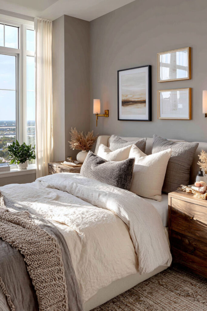
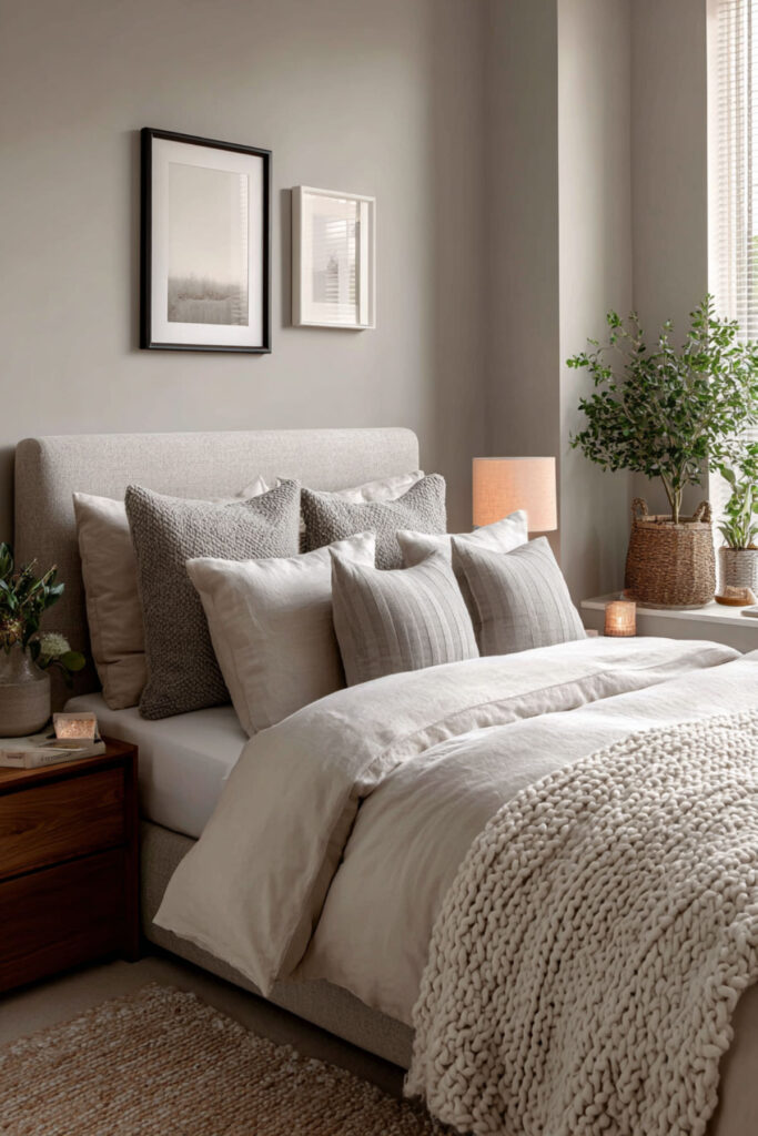
Dove Grey: Quiet, Sophisticated, Endlessly Versatile
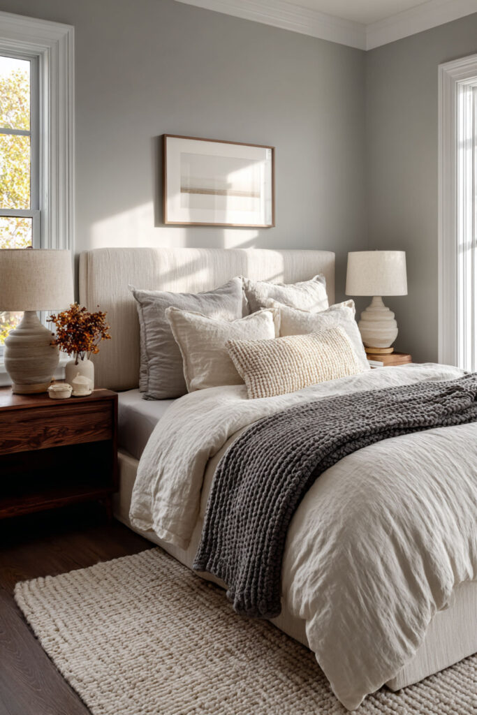
Dove grey is the color of calm without opinion. It doesn’t push the room in any emotional direction — it simply quiets everything down. It absorbs contrast, softens hard lines, and makes every other object in the room (art, bedding, furniture) stand out without competing. For a minimalist bedroom where the design is clean and the priority is rest, dove grey is the wall color that gets out of the way. I recommend a soft dove grey with warm undertones (not blue-grey, which can feel cold) in a flat or matte finish. Pair it with white, cream, blush, and brushed brass or warm metallics. This calming bedroom wall colors and Sherwin Williams neutral paint colors idea is the sophisticated neutral for women who want their room to feel collected, composed, and deeply restful.
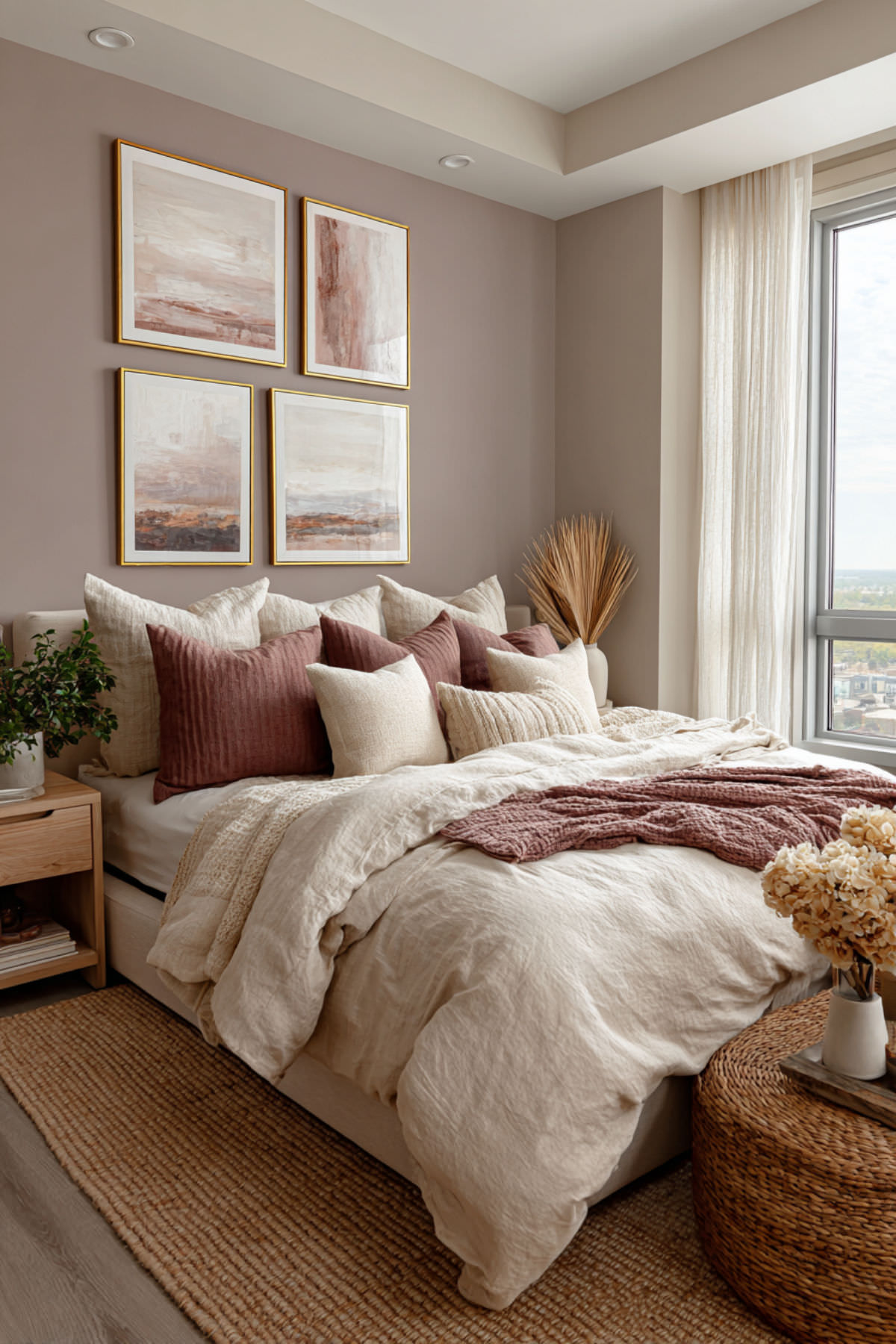
Muted Blush: Warmth Without Sweetness
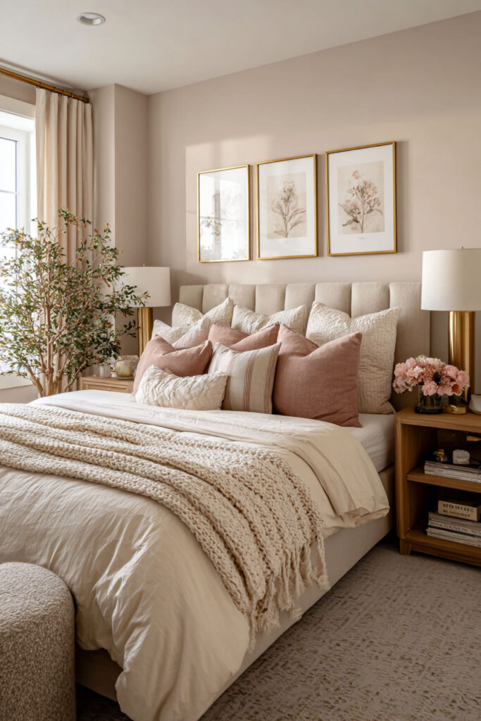
Blush, when it’s done right, is not a young color. Muted blush — a dusty pink with beige or grey undertones — is warm, elegant, and surprisingly calming. It adds a gentle rosiness to the room that makes skin tones look beautiful in any light (which matters more than people think when you spend time in a room every day). It also pairs with virtually every neutral and every warm metal, giving you enormous flexibility in bedding, furniture, and accessories. I recommend a muted blush or dusty rose paint with enough grey or beige to keep it from reading as pink — the goal is warmth, not sweetness. Pair it with taupe, cream, warm wood, and aged brass. This calming bedroom colors romantic and calming bedroom color ideas concept is for the woman who wants her bedroom to feel warm and beautiful without any frills.
Soft Chambray Blue: Relaxed, Lived-In, Sleep-Friendly
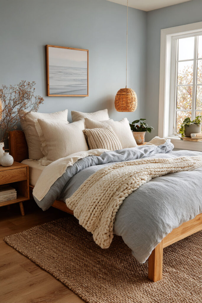
Chambray blue — the color of a perfectly worn-in chambray shirt — is a medium-light blue with a slightly washed, lived-in quality that makes it feel relaxed rather than formal. It’s bluer than dusty blue but softer than true blue, and it creates a bedroom that feels like a weekend morning: unhurried, calm, completely at ease. Blue is consistently the top-recommended color for sleep by color psychologists, and chambray sits right in the sweet spot between enough color to feel intentional and enough muting to feel restful. I recommend a chambray blue paint in a flat or eggshell finish, paired with white trim, natural linen, and light-toned wood. This best bedroom colors for relaxation and most relaxing bedroom paint colors idea is the color for women who want calm that also feels warm and inviting — not clinical, not cold, just easy.
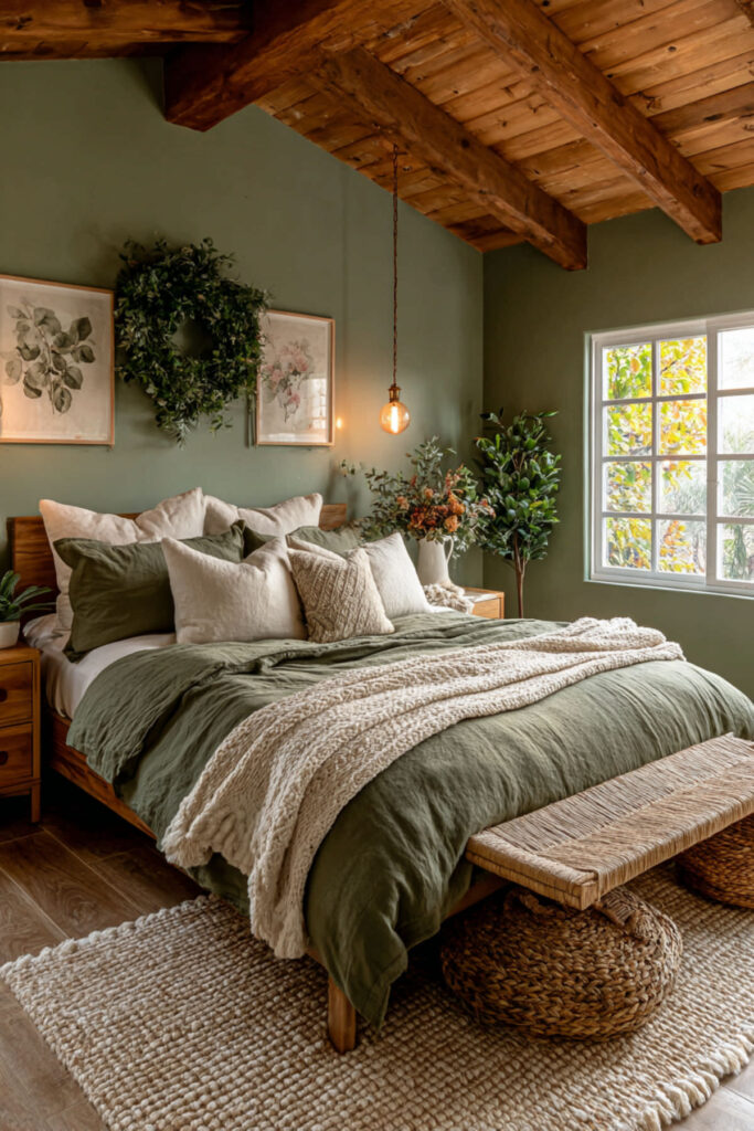
Sage Green and Cream Color Palette: The Complete Calming Scheme
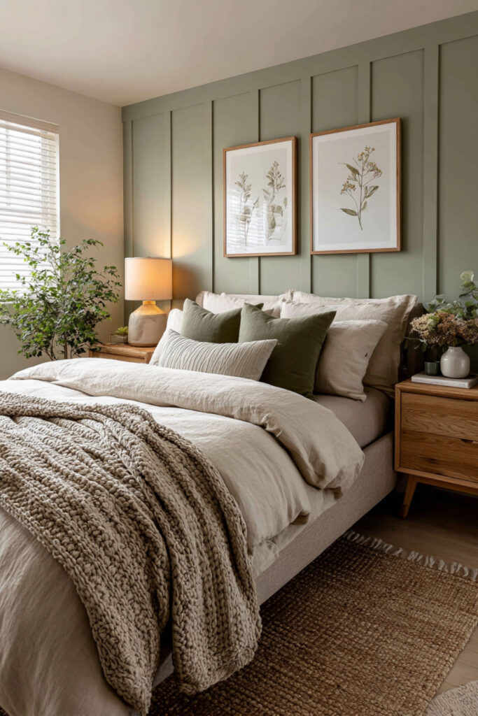
If sage green is the most proven calming wall color, then sage and cream is the most proven calming color palette. Cream on the ceiling, trim, and bedding; sage on the walls; warm wood on the furniture and floors; soft gold or brass on the hardware and lighting. Every element works together to create a room that feels like a garden in late afternoon light — warm, green, soft, completely at peace. I strongly recommend this palette as the complete calming bedroom color scheme — sage walls, cream ceiling and trim, cream or ivory bedding, warm oak or walnut furniture, and brushed gold accents. This sage green and cream bedroom ideas and calming bedroom color schemes and calm bedroom color palette idea is the full recipe: follow it exactly and the room will feel restorative from the first night.
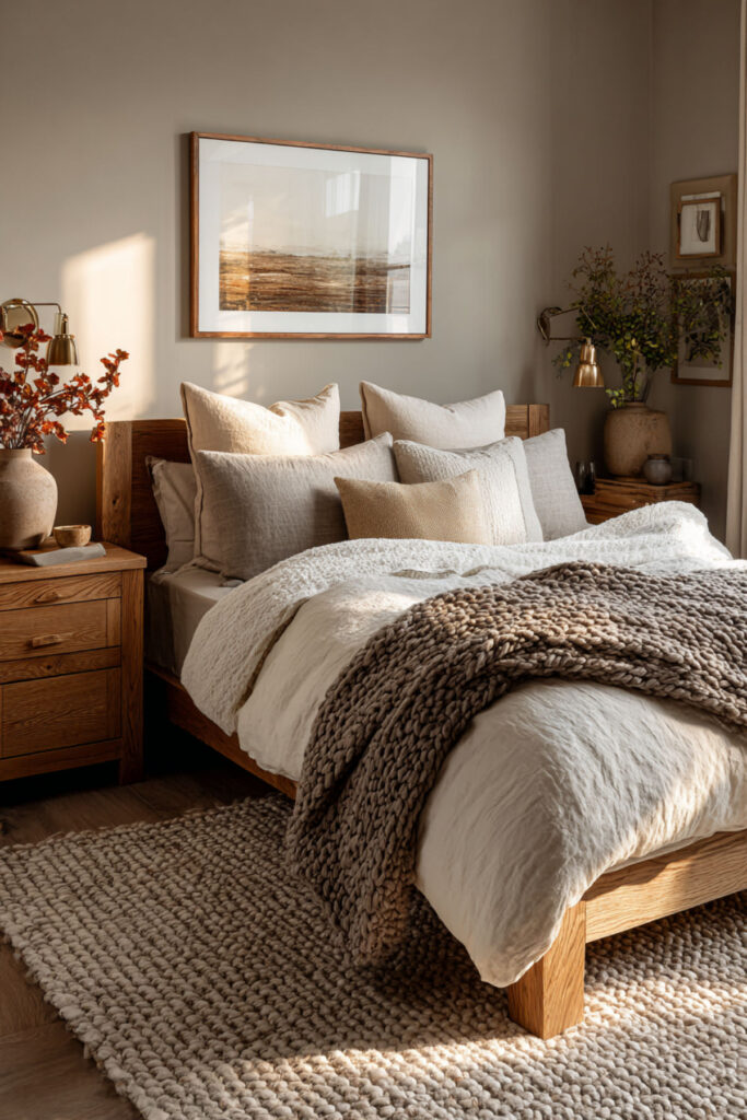
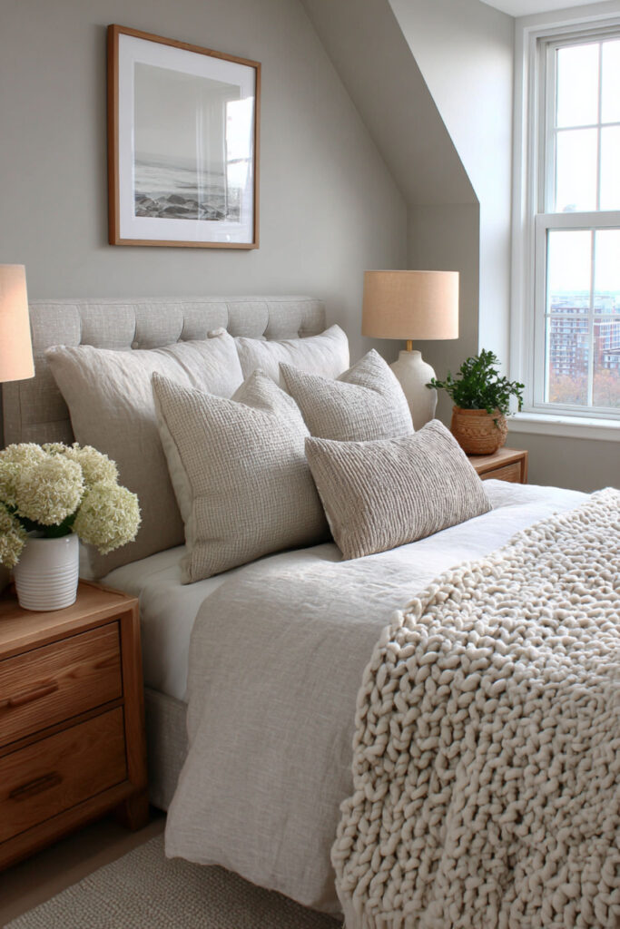
Soft Stone Grey: The Colour of Quiet Rooms
Stone grey — warmer than dove grey, cooler than taupe — has the quality of silence. It’s the color of old European plaster walls, of limestone, of rooms that have been quiet for a long time. In a bedroom, stone grey creates a sense of permanence and peace that trendy colors can’t achieve. It doesn’t ask for attention and it doesn’t provoke a reaction — it simply holds space. I recommend a soft stone grey with warm undertones in a matte or flat finish — pair it with ivory, cream, dark linen, and antique brass or oil-rubbed bronze hardware. This calm bedroom paint colors and serene bedroom colors idea is for women who want their bedroom to feel like it’s been calm for decades — timeless, settled, and deeply restful.
Pale Seafoam: Soft Blue-Green for Spa-Like Rest
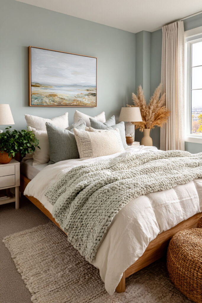
Seafoam — a pale blue-green that sits exactly between blue and green on the color wheel — combines the calming benefits of both colors in a single shade. It feels spa-like without being themed, coastal without being literal, and calming without being boring. The blue-green combination is particularly effective for sleep because it works on both the cooling response (blue) and the nature-connection response (green) simultaneously. I recommend a very pale seafoam with grey or white undertones in a flat or eggshell finish — if it looks like toothpaste, it’s too bright. Pair with white, light grey, and natural textures like linen and cotton. This calming colors for bedroom sleep and peaceful bedroom colors idea is the color for women who want one shade that does double duty: cooling and grounding at the same time.
Choosing the Right Paint Finish: The Invisible Factor
This isn’t a color — it’s the knowledge that makes every color on this list work better for sleep. Paint finish matters as much as color in a rest-focused bedroom. Glossy and satin finishes reflect light, which increases visual stimulation and can create glare that disrupts the room’s calm atmosphere. Flat and matte finishes absorb light, creating a softer, quieter visual field that supports relaxation. Every sleep-focused bedroom should use flat or matte paint on the walls and ceiling. I strongly recommend flat or matte finish for all bedroom walls and ceilings — save eggshell or satin for trim where durability matters. This paint color ideas for bedroom and bedroom wall paint colour guidance is the invisible upgrade that most people skip but every sleep-focused room needs: the finish determines how the color behaves in light, and flat finishes keep the room quiet.
Building Your Calming Color Palette: The Three-Layer Method
The last idea is the strategy that ties everything together. A calming bedroom color palette isn’t one color — it’s three layers working together. Layer one: the dominant color (your walls — choose any color from this list). Layer two: the supporting neutral (your ceiling, trim, and bedding — cream, white, or ivory work with every wall color here). Layer three: the accent tone (your throw pillows, art, rug, hardware — a warm metallic, a deeper shade of your wall color, or a complementary earth tone). When all three layers are intentional and consistent, the room feels designed — not just painted. I recommend choosing your wall color first, then selecting a supporting neutral that’s within the same temperature family (warm wall = warm neutral, cool wall = cool neutral), then adding one accent tone that adds depth without contrast. This calming bedroom color schemes and calming color scheme ideas and bedroom color combination strategy is the difference between a room with nice paint and a room that feels like a sanctuary.
The Color That Helps You Rest Is the One That Disappears
The best calming bedroom color is the one you stop noticing after the first week — not because it’s boring, but because it’s doing its job so well that it blends into the feeling of the room itself. You don’t think about the walls. You think about how the room makes you feel when you walk in at the end of the day: quiet, held, ready to rest. That feeling is what a calming color creates, and it’s what every woman in this phase of life deserves in the room where she sleeps. Take a look at these Nature-Inspired Bedroom Color Schemes for Women Creating a Digital Detox Sanctuary for a bedroom that feels calm, grounding, and refreshingly unplugged.
Pin the colors that felt right as you read them. Save the palettes that match the light in your room and the furniture you already own. Test a sample swatch on the wall and live with it for three days in different light before committing — morning light and evening light change everything. And when you want more guidance on building a bedroom designed for deep rest, the rest of our site is here for you.
Here are a few more ideas you may want to hold onto — remember to save them.
Hope you discovered something inspiring—explore my site for more dreamy bedroom ideas.
⫸ Click Here For Best Selling Sublimation Printers And Products ⫷